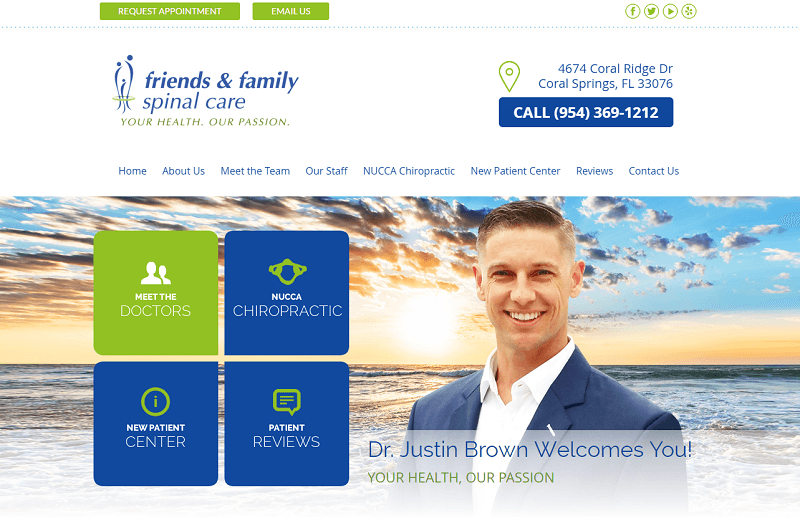
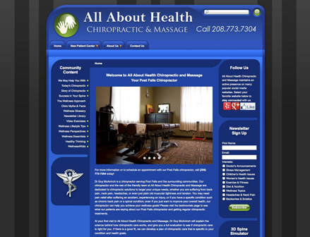
In today’s competitive digital world, your website is your differentiator.
In fact, it could be the reason a prospective patient chooses you over a competitor. But any old website won’t do. It must stand out from the countless other chiropractor website designs on the Web.
How do you differentiate your website? The answer is simple: Build your website for your patients, not for you.
48% of people cite a website’s design as the number one factor in deciding the credibility of a business.
Rankings Don’t Matter If They Don’t Convert
With over a billion websites on the Internet today, search engines are cluttered with a seemingly endless flow of search results.
See for yourself: Type, “chiropractor in St. Louis, MO,” in Google and you’ll see page after page of chiropractic websites.
Typically, performing such a search is what a prospective patient would do when looking for a chiropractor. So you want your website to rank well.
However, your positioning in the search results is irrelevant if your website isn’t converting new patients.
The heart and soul of effective website design is making the user happy. You have a matter of seconds to capture a visitor’s attention before they’ll hit the “back” button. You want to immediately let that visitor know they are in the right place. You want to quickly show them that you are the chiropractor for them.
And there are several ways to do that…
Keep Your Website Design Modern and Mobile-Friendly
A website design starts showing its age within three to five years.
One of the most glaring developments in the modern web design world was the introduction of mobile. Google gives preference to mobile-friendly websites, penalizing those that do not cater to smartphones and tablets.
Equally important as the search engine benefits of a mobile-friendly website is the user experience. Whether a webpage takes too long to load or a mobile user has to zoom in and out to read content, the results are the same: an unsatisfactory user experience.
And considering nearly 60 percent of searches are now performed on a smartphone or tablet, this could be a lot of unsatisfied visitors.
Shortened attention spans is another major shift in user behavior. People scroll through their Facebook pages all day long. They glance at Tweets no longer than 140 characters. Viewing a webpage full of endless blocks of text could send them straight to a competitor’s website. This is why it’s important to make your website readable and browsable.
Keep your website visitors reading with these design tips:
- Keep paragraphs to fewer than four sentences
- Include at least one image on each page
- Split up content with headings and subheadings
- Use bulleted lists when relevant (like we’re doing here)
![]()
Showcase Your Practice Personality
People prefer to do business with people they can relate to. Your website gives you an opportunity to show your “human” side, to showcase your practice personality.
For example, a compelling “Meet the Doctor” page creates an emotional connection with prospective patients. Sure, it’s important to validate your clinical skills. But, also, get personal by discussing your interests, philosophies, and the reason you joined the chiropractic profession.
Do you come from a family of chiropractors? Was it a personal chiropractic experience that inspired you? This is an opportunity to express yourself in an authentic way.
Along with written content, it’s important to provide visual content as well. Professional photos of you, your office, and your team, help show visitors see what it’s like to be your patient.
Studies show that personal photos communicate trust. This is especially important for businesses that offer personal, client-facing services like chiropractic care. According to one study:
- Genuine photos of the owner inspire the most trust (46 percent)
- Generic photos inspire moderate trust (33 percent)
- No images at all inspire very little trust (21 percent)

![]()
The 5 Most Important Pages
Your homepage is your first impression. It should clearly state who you are and what you offer.
Beyond your homepage, there are four other “money pages” that we have determined are the most powerful from years of collecting data from our New Patient Tracker technology.
They are (in order of importance):
- Doctor[s] Bio
- Contact Us
- About Us
- Services
Make sure these pages are also designed to convert with the same attention to detail that’s given to your homepage. Make a connection with the website visitor. Showcase your specialty. Describe your passion for the profession. Whatever makes your practice special, share it!
Guide the New Patient Journey From Start to Finish
Your website should nurture visitors from start to finish – “finish” being a scheduled appointment.
Remember, your content should be written for patients, and should answer one simple question:
“Why should I choose you as my chiropractor?”
Answering this question requires unique, well-written content. Generic, copy-and-paste content will send visitors straight for the “back” button.
Once you have a prospective patient’s attention, and they’re learning more about your practice, you must call them to action.
A call-to-action (CTA) is the final step in the new patient journey. Think of a CTA as directions that lead someone to a destination – “Click here to schedule an appointment” or “Give us a call today.” A CTA keeps your website visitors from wandering a busy street that has no direction but back to Google.
Key Takeaways
- Your chiropractic website design should cater to patients. Hire an experienced designer who knows how to build a conversion-friendly design.
- The shelf life of a website is three to five years, so be sure to refresh your design frequently.
- Mobile-friendly design and fast page load speed are important for pleasing Google and maintaining a quality user experience.
- Quality, browsable content, images that showcase your practice personality, and CTAs that guide patients toward booking an appointment are essential to getting more new patients from your website.


