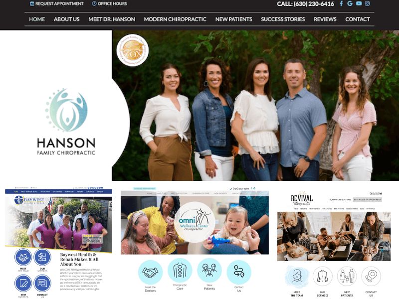
We talk a lot about chiropractic website design and what makes a website “conversion-friendly,” but today we thought we’d show you.
Here are five awesome chiropractic website examples along with explanations of how the designs will help the doctors get more new patients.
#1 – Professional Photography Packs a Punch
What’s the first thing you notice when you look at this site? It’s the photos, right? Those big, beautiful professional photos of the Infinity team immediately grab your attention. They are welcoming you to their practice by putting themselves front and center. They know that choosing a chiropractor is an important, personal decision and that they need to earn the trust of their prospective patients.
Studies show that photos of the business owner on the business website inspire more trust in visitors than stock photos or no photos at all. Which is why we strongly encourage our clients, like Infinity, to showcase professional photos of themselves, their office, and staff on their website. It makes all the difference.
#2 – Tailored to their Target Demographic
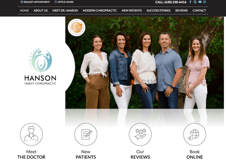
When you visit the Hanson Family Chiropractic website, you know exactly what Dr. Hanson specializes in – pediatric and pregnancy care. From the content to the photo of the doctor with his own family, you know that this is a family place. And that is important when trying to choose a chiropractor for your precious little ones.
Visit the Office Tour page and you’ll see professional photos of the office, including staff members and patients – happy kids playing with office toys. The content explains their philosophy. All of this combines to create a website that will attract Hanson Family Chiropractic’s ideal patients.
#3 – Modern Site for a Modern Practice
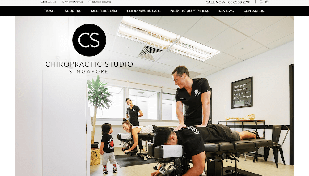
The Chiropractic Studio Singapore website is a clean, modern design. From the large, colorful photos of patients under care, to the elegant use of the color black and the minimalist practice logo, this website design is appropriate for a chiropractic office located downtown in a busy city.
The call-to-action (“Call Now” and phone number) is hard to miss and the buttons leading to the important pages (Meet the Team, Chiropractic Care, Reviews, and New Studio Members pages) are front and center so that busy city dwellers can quickly find the information they need.
#4 – All About the Patients
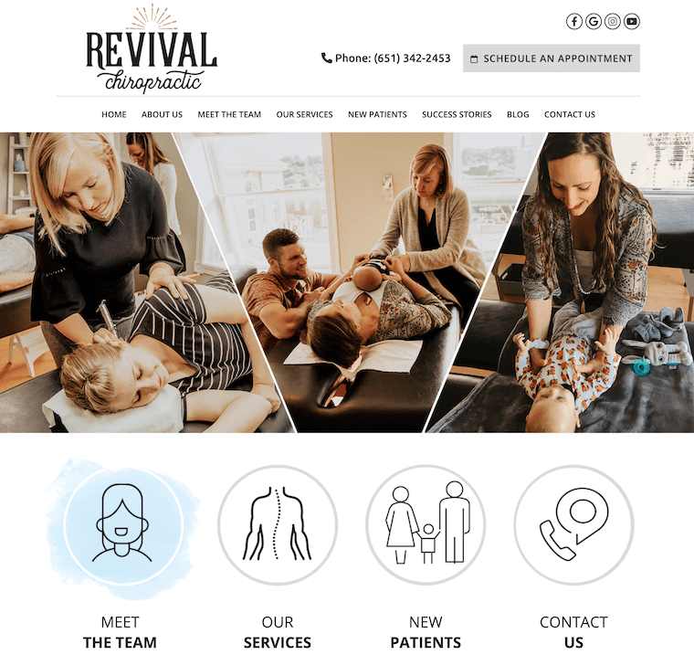
When prospective patients visit the Revival Chiropractic website, they aren’t inundated with too much information. Instead, they’re greeted by images of patients in care and clear calls-to-action. A prospective patient who is ready to begin care immediately will be drawn to the “Contact Us” button while someone who is still in the research stage may click on the “New Patients?” button.
It’s clear. It’s patient-centered. It converts.
#5 – The Power of Social Proof
Did you know that 91% of consumers check out online reviews when looking for a local business online? And that 84% trust online reviews as much as they trust personal recommendations from friends and family?
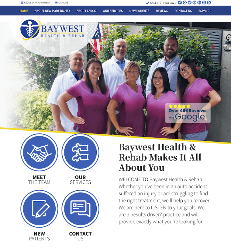
Baywest Health & Rehab knows the power of social proof. With over 180 positive Google reviews, they’re able to let their current patients “sell” their prospective patients on their services by linking to the reviews right on their homepage.
Another conversion-friendly aspect of this website design is the patient-centered content. It is very clear that they pride themselves on listening to their patients and even greet them with a cup of coffee! Prospective patients can tell right away if this is the practice for them. And that’s just the way it should be!
Chiropractic Website Design that Converts
If your practice website isn’t converting new patients, it may be time to upgrade. Check out our three service plans to see what Perfect Patients can do for you.

